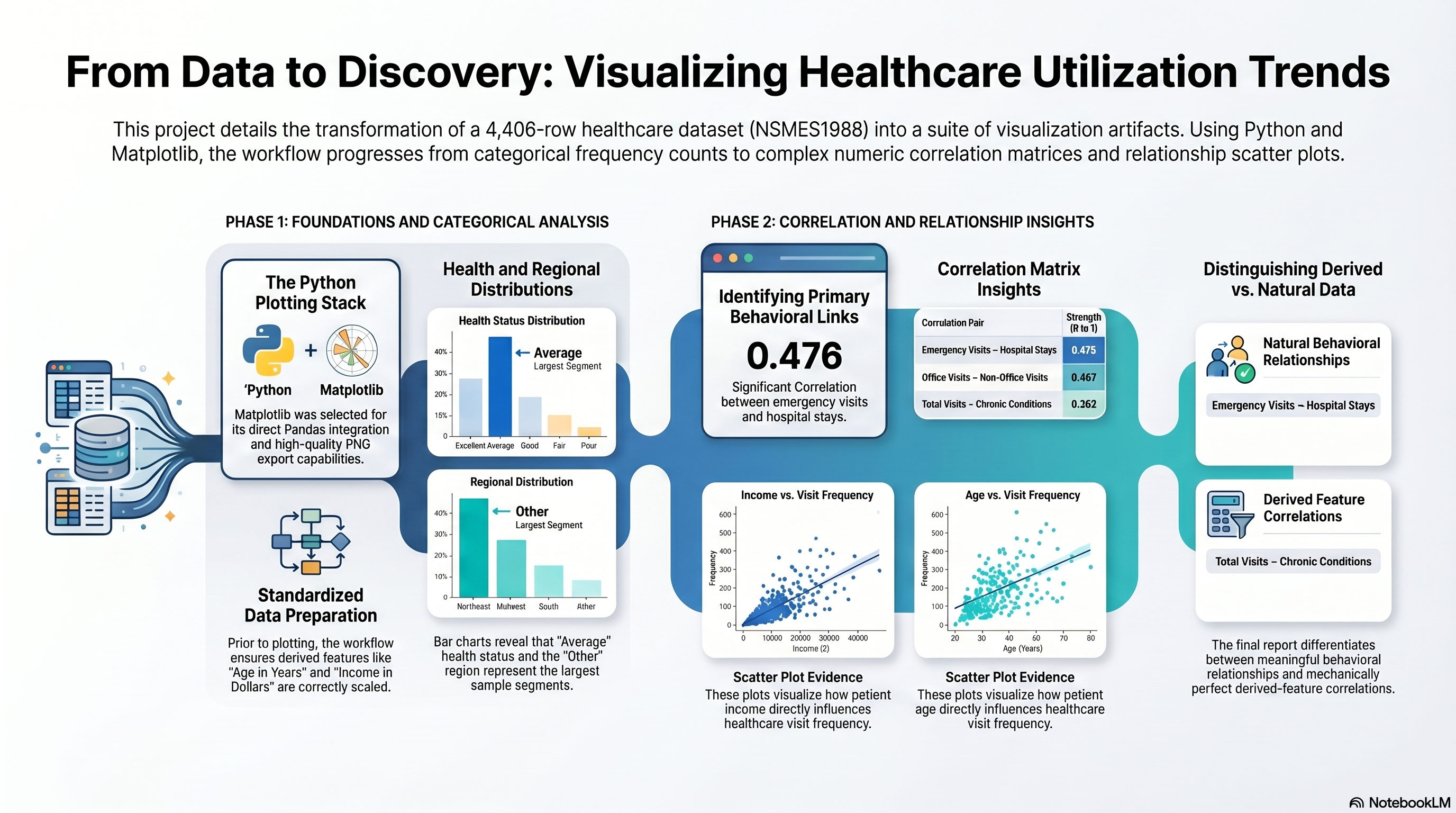
num_df = df.select_dtypes(include=["number"])
corr = num_df.corr(numeric_only=True)
show(corr)

fig, ax = plt.subplots(figsize=(10, 8))
cax = ax.imshow(corr, cmap="coolwarm", vmin=-1, vmax=1)
fig.colorbar(cax, ax=ax, fraction=0.046, pad=0.04)
ax.set_xticks(range(len(corr.columns)))
ax.set_yticks(range(len(corr.columns)))
ax.set_xticklabels(corr.columns, rotation=90)
ax.set_yticklabels(corr.columns)
ax.set_title("Correlation Matrix (Numeric Features)")

out = PLOTS_DIR / "correlation_matrix.png"
fig.tight_layout()
fig.savefig(out, bbox_inches="tight", dpi=150)
plt.show()
print("Saved:", out)

scatter_specs = [
    ("income_dollars", "visits", "scatter_income_vs_visits.png", "Income vs Visits"),
    ("age_years", "visits", "scatter_age_vs_visits.png", "Age vs Visits"),
    ("income_dollars", "emergency", "scatter_income_vs_emergency.png", "Income vs Emergency Visits")
]

for x, y, fname, title in scatter_specs:
    if x in df.columns and y in df.columns:
        fig, ax = plt.subplots(figsize=(6.5, 4.5))
        ax.scatter(df[x], df[y], alpha=0.3, s=12)
        ax.set_title(title)
        ax.set_xlabel(x)
        ax.set_ylabel(y)
        out = PLOTS_DIR / fname
        fig.tight_layout()
        fig.savefig(out, dpi=150)
        plt.show()
        print("Saved:", out)
Output
                  visits   nvisits   ovisits  novisits  emergency  hospital  \
visits          1.000000  0.226365  0.068144  0.078468   0.158748  0.240789
nvisits         0.226365  1.000000  0.001129  0.041768   0.049056  0.050401
ovisits         0.068144  0.001129  1.000000  0.466923   0.065388  0.110573
novisits        0.078468  0.041768  0.466923  1.000000   0.024083  0.065301
emergency       0.158748  0.049056  0.065388  0.024083   1.000000  0.476061
hospital        0.240789  0.050401  0.110573  0.065301   0.476061  1.000000
chronic         0.261886  0.037113  0.100805  0.040748   0.203845  0.233524
age             0.003404 -0.041640 -0.040028 -0.032813   0.061023  0.074122
school          0.064433  0.085974 -0.012156 -0.011733  -0.071192 -0.036082
income         -0.004951  0.010731 -0.004267 -0.007786  -0.026462 -0.014183
age_years       0.003404 -0.041640 -0.040028 -0.032813   0.061023  0.074122
income_dollars -0.004951  0.010731 -0.004267 -0.007786  -0.026462 -0.014183

                 chronic       age    school    income  age_years  \
visits          0.261886  0.003404  0.064433 -0.004951   0.003404
nvisits         0.037113 -0.041640  0.085974  0.010731  -0.041640
ovisits         0.100805 -0.040028 -0.012156 -0.004267  -0.040028
novisits        0.040748 -0.032813 -0.011733 -0.007786  -0.032813
emergency       0.203845  0.061023 -0.071192 -0.026462   0.061023
hospital        0.233524  0.074122 -0.036082 -0.014183   0.074122
chronic         1.000000  0.099758 -0.065829 -0.047397   0.099758
age             0.099758  1.000000 -0.142996 -0.073130   1.000000
school         -0.065829 -0.142996  1.000000  0.259199  -0.142996
income         -0.047397 -0.073130  0.259199  1.000000  -0.073130
age_years       0.099758  1.000000 -0.142996 -0.073130   1.000000
income_dollars -0.047397 -0.073130  0.259199  1.000000  -0.073130

                income_dollars
visits               -0.004951
nvisits               0.010731
ovisits              -0.004267
novisits             -0.007786
emergency            -0.026462
hospital             -0.014183
chronic              -0.047397
age                  -0.073130
school                0.259199
income                1.000000
age_years            -0.073130
income_dollars        1.000000
<Figure size 1000x800 with 2 Axes>
Saved: c:\DEV_Projects\SIMPLILEARN\CAPSTONE_Applied_Data_Science_with _Python\Incremental_Capstone\Capstone 4\outputs\plots\correlation_matrix.png
<Figure size 650x450 with 1 Axes>
Saved: c:\DEV_Projects\SIMPLILEARN\CAPSTONE_Applied_Data_Science_with _Python\Incremental_Capstone\Capstone 4\outputs\plots\scatter_income_vs_visits.png
<Figure size 650x450 with 1 Axes>
Saved: c:\DEV_Projects\SIMPLILEARN\CAPSTONE_Applied_Data_Science_with _Python\Incremental_Capstone\Capstone 4\outputs\plots\scatter_age_vs_visits.png
<Figure size 650x450 with 1 Axes>
Saved: c:\DEV_Projects\SIMPLILEARN\CAPSTONE_Applied_Data_Science_with _Python\Incremental_Capstone\Capstone 4\outputs\plots\scatter_income_vs_emergency.png


